One of the strengths offered by Linux is that you can customize the system to the way you like it. This is certainly true for the desktop. We looked at the best Linux desktops environments, and it’s important to distinguish that some desktops offer far more customization options.
KDE and GNOME are highly respected desktops. GNOME has witnessed a slimming down of features in recent releases, although there are plenty of GNOME extensions that let you configure the desktop. But when it comes to customization, arguably no other desktop comes anywhere close to KDE Plasma 5. There’s so many aspects of Plasma you can customize and tweak.
Let’s begin the customization journey with KDE Plasma themes. All of the themes are available at the KDE store, they’re really easy to install, and you can tweak them even further to make your environment beautifully crated.
KDE-based distributions ship with some great themes. For example, Manjaro comes with 7 desktop themes as shown below.
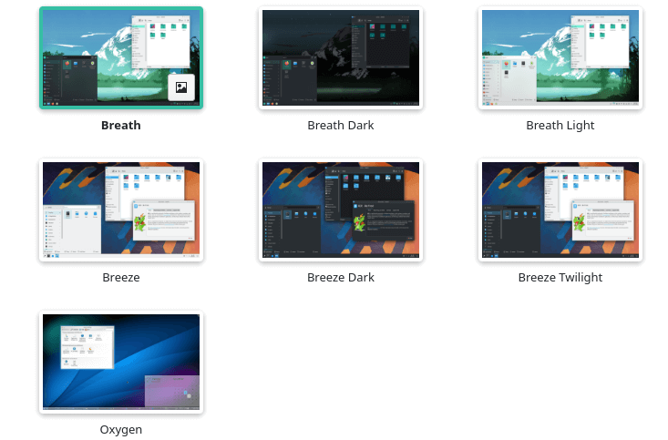
The default KDE theme looks great, but is it ideal for your preferences? Probably not. Here’s some alternatives to KDE’s supplied themes.
Let’s start the ball rolling with Arc KDE.
1. Arc KDE
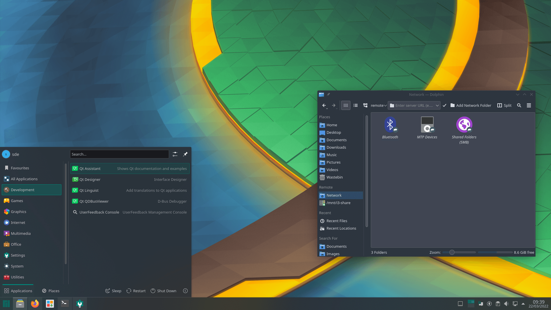
This is a port of the popular GTK theme Arc for Plasma 5 desktop with a few additions and extras. The project’s GitHub repository provides Aurorae themes, Konsole color schemes, Konversation Themes, Kvantum Themes, Plasma Color Schemes, Plasma Desktop Themes, and Plasma Look-and-Feel Settings. For good measure there’s also wallpapers and Yakuake skins.
If we only had one word to describe Arc KDE it would be the word ‘Awesome’. Permit us two words and we’d remark ‘Really Awesome’. Enough said!
It’s licensed under the GNU General Public License version 3.
2. Mondrian
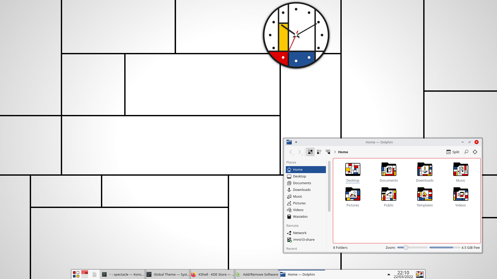
Mondrian makes your desktop slick and modern looking with its abstract expressionism style. It’s really well developed and makes a huge statement.
This theme is inspired by Piet Mondrian’s paintings. This Dutch painter and art theoretician is considered one of the finest artists of the 20th century.
3. Edna
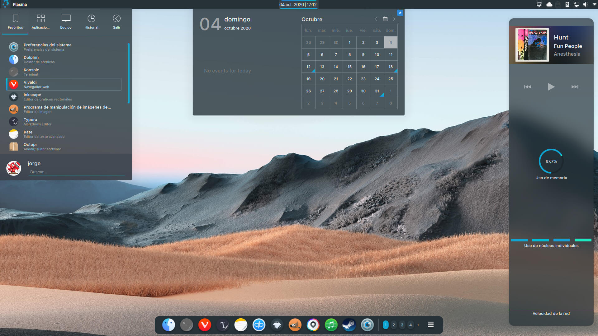
If you’re a fan of British TV, the name Edna may remind you of Willo the Wisp, a popular cartoon series narrated by Kenneth Williams. Edna was a witch in the form of a walking, talking television set, who could zap people with her aerials.
We digress. Edna is a marvelous Plasma theme. It looks great in every respect.
4. Sweet KDE
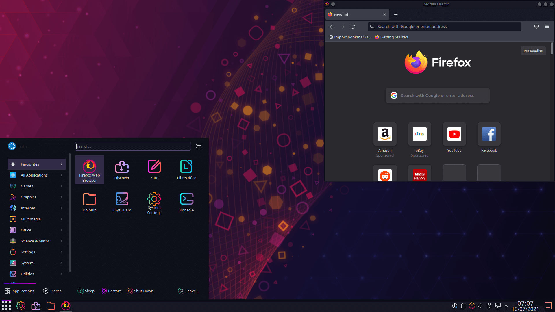
Sweet KDE is a dark and modern theme for Plasma based on the awesome Helium theme. Helum doesn’t seem to be supported on the latest version of KDE, but Sweet KDE is a more than capable alternative.
5. ROUNDED
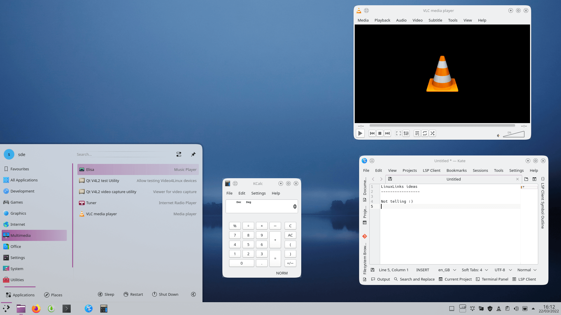
Do you want all your desktop elements and icons to have rounded corners? If so, ROUNDED might be a good choice. We prefer the light theme.
This style seeks inspiration from Breeze. It comes supplied a Space Plasma wallpaper but we’ve chosen a different wallpaper for our screenshot.
6. Layan
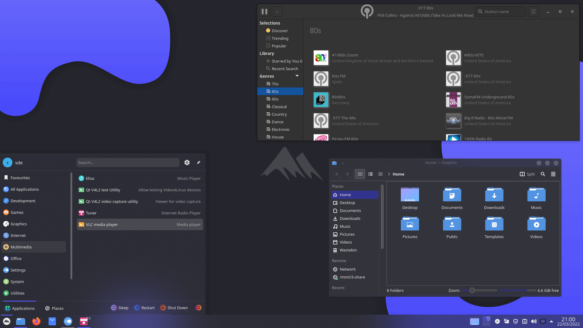
Layan is another modern and elegant design theme for KDE Plasma. It sports a slick color scheme that’s minimalist but somewhat an acquired taste.
Next page: Page 2 – More Awesome Themes
Pages in this article:
Page 1 – Introduction / Awesome Themes
Page 2 – More Awesome Themes
Page 3 – Yet more…
Page 4 – Mimic other operating systems

Mondrian is definitely the most striking theme I’ve seen
I loved IRIX with 4Dwm window manager. It was based on the classic Motif window manager. That reminds me, I must try Motif again, it was open sourced eventually.
Live for the moment, not the past.
Dracula looks cool
it’s my favorite
None of them have a transparent kicker. Also too much darkness. I just build my own from 3 to 4 other styles. If you are in the know it is easy. Inkscape can be your friend. If you want some color, dig up the old oxygen kicker icon set. The current rage of dark and no color is hard on old eyes.
Dark themes are kinder on older eyes.
Some of the dark themes here have light versions too.
Not for my older eyes (66). Dark makes it hard for me to read. Redshift is what I need.
There is useful eye care software here.
I concur with James, for older eyes (68) dark is not a good choice. I certainly understand younger eyes enjoying the contrast and lower brightness. I’m pretty happy with the ChromeOS Light theme but use either Breeze Extra Icons or Breeze Rounded Icons along with Breeze window decorations. Frankly I have not seen a window decoration I would change Breeze for, they baked that cake just right!
My sentiments exactly